The Travora brand
Official Travora logos, banner and colors. Use these assets to keep a clear, consistent and recognizable identity everywhere.
What does the logo say?
The Travora logo brings together three simple ideas: finding your way, choosing your destination and leaving with confidence.
A needle pointing forward
At the center, a needle points forward. It evokes the compass: Travora helps travelers understand where they can go, what formalities to expect, what budget to plan and which season to choose.
An open map, a route
The lower shape recalls an open map crossed by a route. It stands for the journey, the preparation and the move from a travel idea to a real destination.
A navigation dial
The upper arc and its markers borrow the codes of a navigation dial. They express clarity, direction and the idea of traveling with no bad surprises.
A reference point
The top dot acts as a marker: north, the starting point or the destination to reach.
The coral
Coral is Travora's primary color. It carries the energy, warmth and boldness of travel, while giving the brand a direct, memorable presence.
Logos
Two versions are available depending on the background.
Light version
White logo on a dark or coral background. Use it when the primary version lacks contrast.
Banner
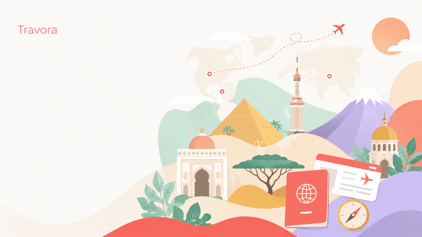
Header visual for social media, share previews and covers.

Colors
Coral carries the main identity. Sand, ink and warm accents balance the interface and create a softer experience.
Click to copy
Good usage
Do
- Always leave space around the logo.
- Use the coral version on light backgrounds.
- Use the light version on dark, dark-image or coral backgrounds.
- Keep the original proportions.
- Keep coral as the primary brand color.
Don't
- Don't distort the logo.
- Don't rotate the logo.
- Don't change the primary color.
- Don't add shadows, outlines or 3D effects.
- Don't place the logo on a busy background.
- Don't recreate the logo by hand.